Text Blocks
Available blocks: Paragraph | Heading | List | Quote | Details | Pullquote | Table | Footnotes | Classic
Important: When pasting text into the editor, be sure font styles, such as font-family, size and line-height, do not carry over from the copied text.
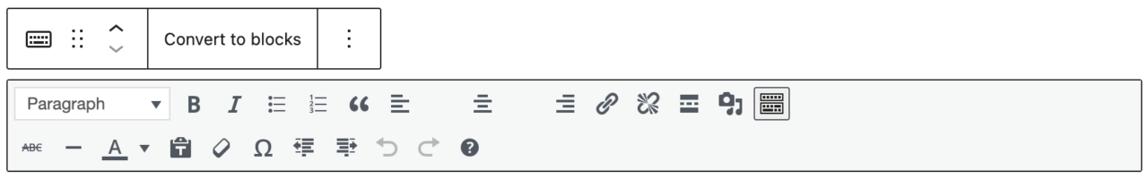
Paragraph Block
Start typing to create a new paragraph block. Every paragraph is its own block. You can select and move multiple blocks, if needed.
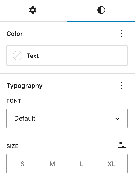
Color Options
Paragraph text only has three colors to choose from: Warm Black (default), Dark Gray and White. Only use white on dark backgrounds if the text is not automatically converted. These color options are shared with the heading block.
- This option should be used very sparingly.
- You cannot color a single word within the paragraph or header block – it is all or nothing.
- To keep with accessibility standards, dark text should only be used on light backgrounds and light text should only be used on dark backgrounds.
Typography Options
Available typography customizations are font family and size. To see styles, click on the styles icon (half-filled circle).
Font Family
The default paragraph text is Suisse Works (serif). You can choose Gibson (sans serif) by clicking on the three dots in the corner of Typography, selecting Font family and choosing Gibson from the dropdown. This is hidden by default because it should be used only in special cases.
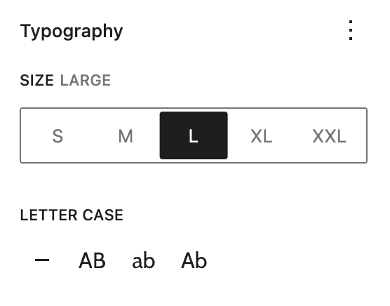
Font Size
Rather than using headings for larger font sizes, you can change the size of paragraph text in the Styles Tab under Typography > Size. Smaller font sizes can be used for captions or notes.
The font sizes are:
Paragraph Small
Paragraph Medium
Paragraph Default
Paragraph Large
Paragraph Extra Large
Heading Block
Introduce new sections and organize content to help visitors (and search engines) understand the structure of your content. Only use headings where a header is needed – do not use them for the larger font size.
To easily add a heading into the content area, start typing /h2 /h3 or /h4 and press enter. Remember to keep headings in order. Headings have similar options to the paragraph block.
Color Options
Headings have the same color options as paragraphs.
Typography Options
Available typography options are font family, size and letter case.
Font Size
H2 Small
h2 Medium
H2 Default
H2 Large
H2 XLarge
H2 XXLarge
H3 Small
h3 Medium
H3 Default
H3 Large
H3 XLarge
H3 XXLarge
H4 Small
H4 Medium
H4 Default
H4 Large
H4 XLarge
H4 XXLarge
Letter case
Headings have a quick letter case toggle available. This can be changed under the typography panel. The options are: None (default), UPPERCASE, lowercase and Capitalize.
This is a pullquote block. You can align it to the left to give it a more dominant position from the rest of the content.
Gyr Falcon
List Block
Create a bulleted or numbered list.
- This is an unordered list with three levels of nested bullets
- Second primary list item
- Level two nested list
- Level three nested list item
- Level two nested list
- This is an ordered list with three levels of nested bullets
- Second primary list item
- Level two nested list item
- Second level two nested list item
- Level three nested list item
- Second level three nested list item
Quote Block
Give quoted text more visual emphasis.
The blockquote is set up differently than a pullquote. The blockquote block has the same typography options available as the paragraph block.
This is a blockquote. You can left, right and center align the text. You can also add bold text.
Lapland Longspur
Details Block
Hide and show additional content in an accordion-style layout. This has the same functionality as our custom accordion block, but was added to the core WordPress block selection more recently.
The summary of the content is visible at all times
The content is hidden until a user clicks on the summary. It can be closed when the user clicks on the summary a second time. It is best to limit this content to text and images.
Second summary text
One block’s visibility does not affect the other.
Pullquote Block
Give special visual emphasis to a quote from your text.
The size options available are:
Small
Medium
Large (default)
XLarge
The quotation marks can be toggled “off” under the Block Styles & Settings Panel by clicking Toggle Quotation Marks.
Table Block
Create structured content in rows and columns to display information.
The easiest way to paste a table into your content is by copying it from the source (ex: cells in a spreadsheet) and pasting it right into the editor. This will create a basic table. Some touching up may need to be done. When the block is already created, content can only get pasted in one cell at a time.
Use tables sparingly and only to display tabular data. Never use them to lay out contents on a page. There are three table styles available:
Default Table
| Header for column 1 | Header for column 2 |
|---|---|
| Row one column one | Row one column two |
| Row two column one | Row two column two |
| Row three column one | Row three column three |
Striped Table Style
| Header for column 1 | Header for column 2 |
|---|---|
| Row one column one | Row one column two |
| Row two column one | Row two column two |
| Row three column one | Row three column three |
Border Table Style
| Header for column 1 | Header for column 2 |
|---|---|
| Row one column one | Row one column two |
| Row two column one | Row two column two |
| Row three column one | Row three column three |
Footnotes Block
Add linked footnotes to the page. To create a footnote:
- Insert the footnote block on the page (preferably at the end of the content)
- In the paragraph text, click “more” in the block toolbar and select “Footnote” 1. A link will be automatically created to the footnote.
- Type the footnote text in the footnote block.
- Footnotes automatically appear in the order that they are in the text.
- This is the linked footnote ↩︎
Classic Editor
The Gutenberg editor also contains a Classic Editor under the text category. This one is more like a Word Document editor. We recommend only using this editor for basic text (headers, paragraphs and lists). Media will not have the same styles as they do with the block editor.
You have the option of converting content from the classic editor to blocks when you are finished.