Media Blocks
Available blocks: Image | Gallery | Slideshow | Cover | Video | Audio | File | Media & Text
This page showcases examples of the the available media blocks. They include images, cover images, gallery, audio, file, video (mp4), and the media and text block. This page also shows an example of photographer credits at the bottom.
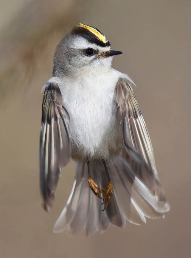
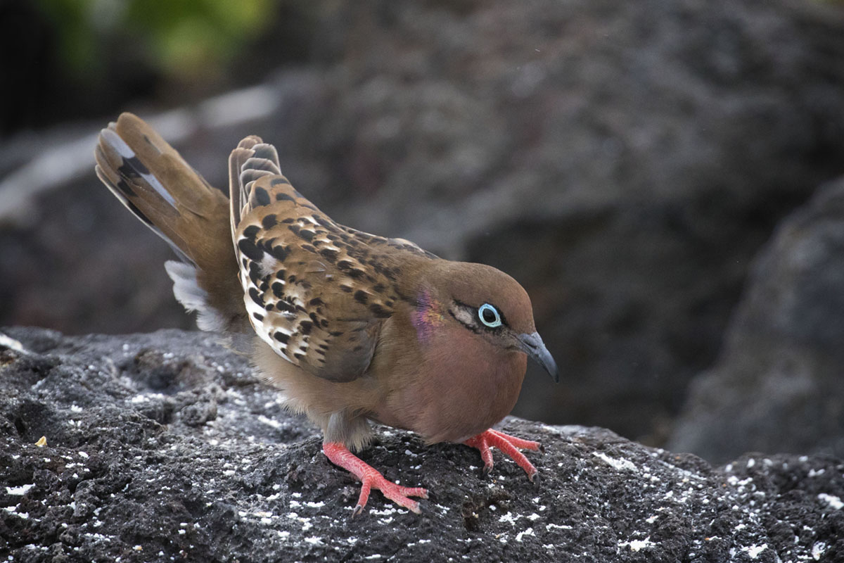
Image Block
Insert an image to support the text. Be sure to add relevant alt tags to images where needed.
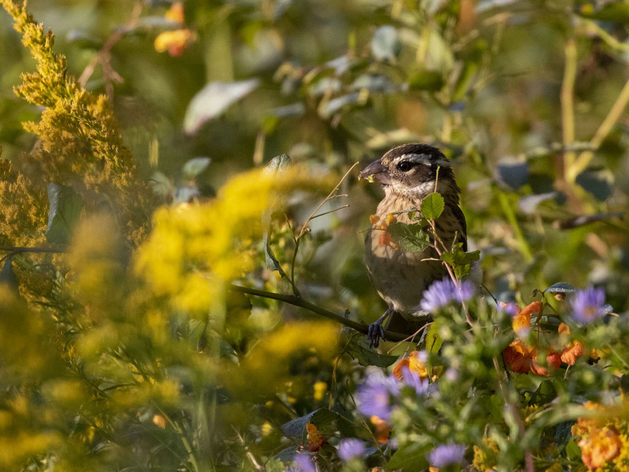
Image Alignments
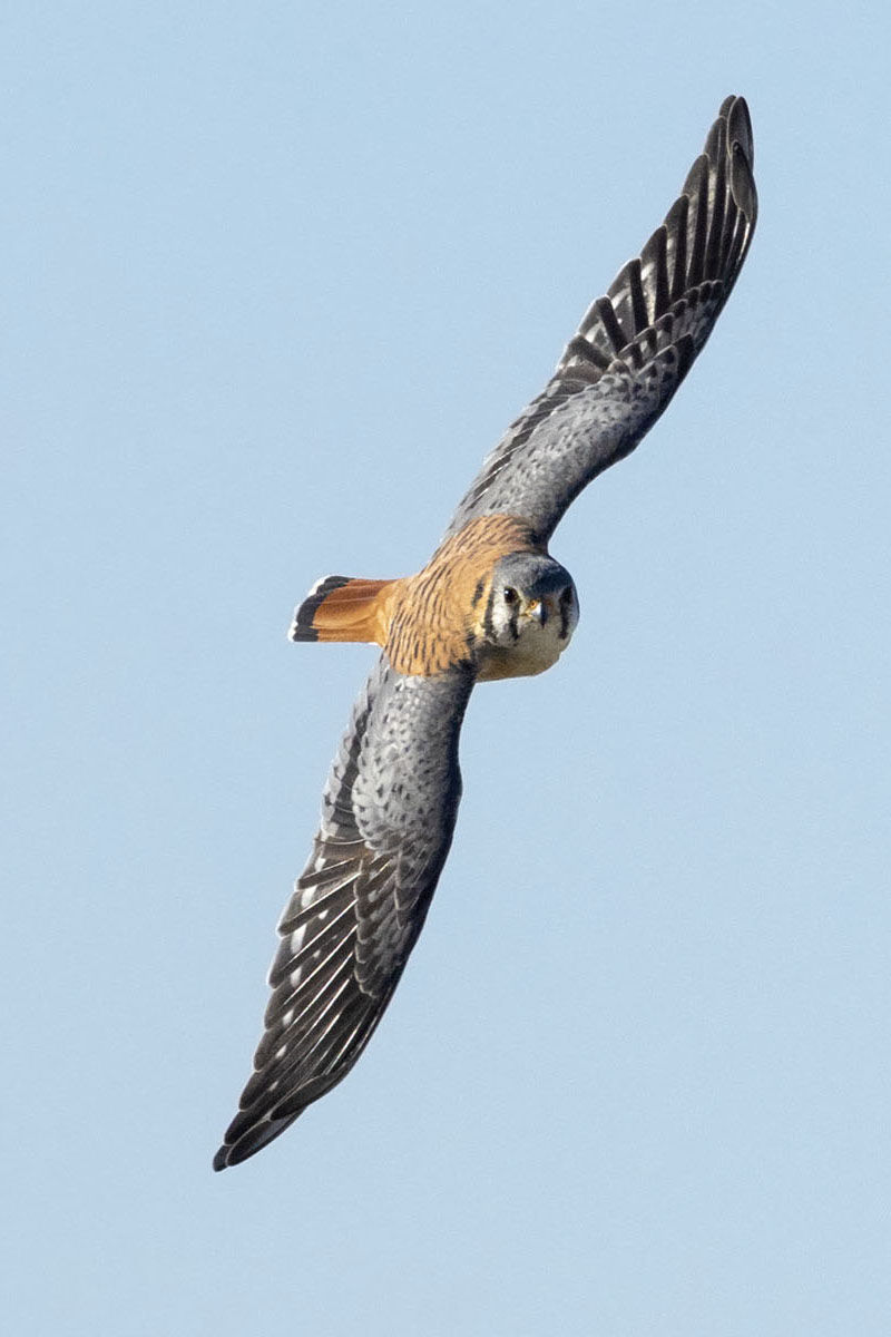
Images can be aligned left or right to flow better with the content. They can also have full, wide or centered alignments.
To align an image, click on the Align icon in the block toolbar and select the preferred alignment.
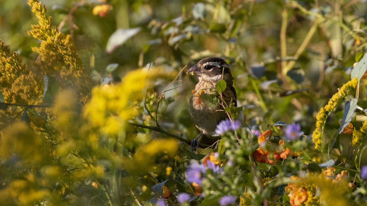
These alignment options also works with videos.
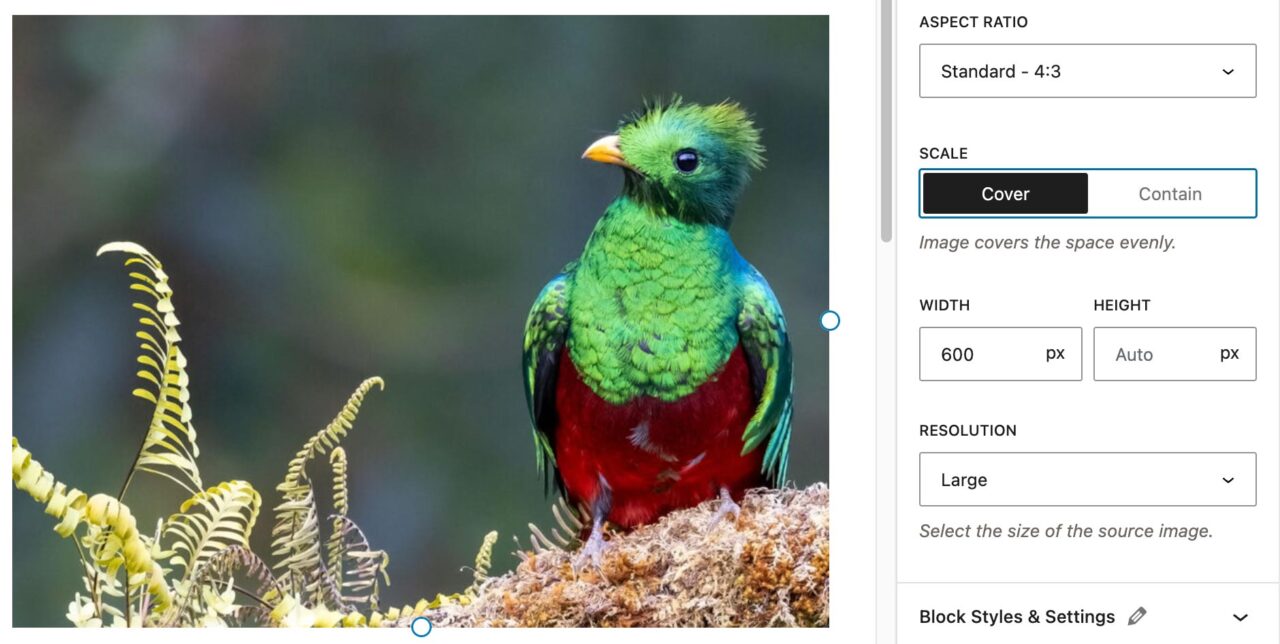
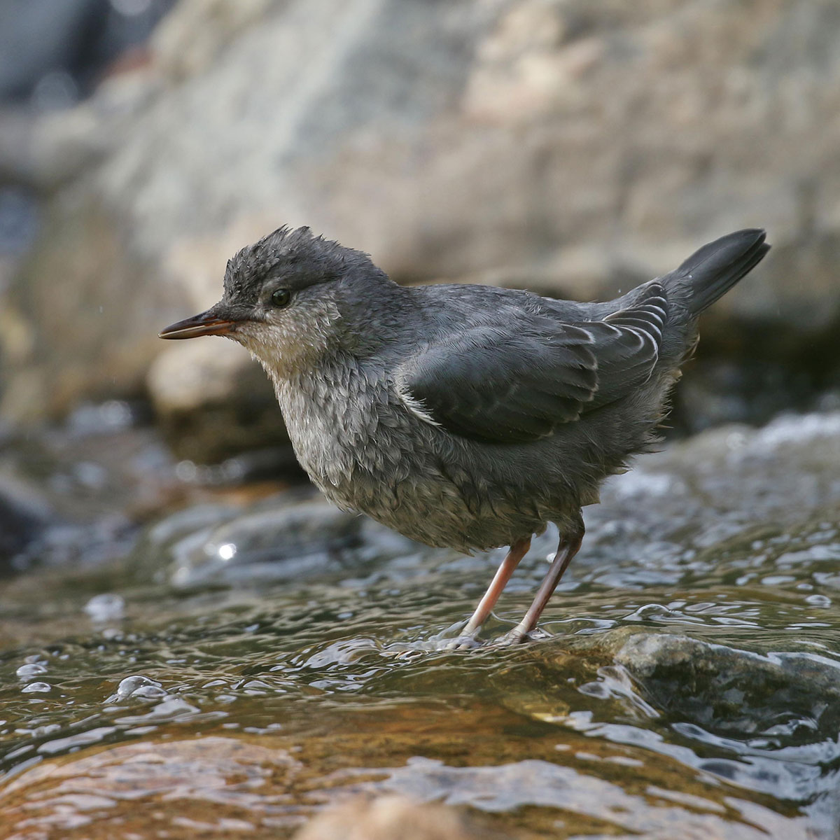
Aspect Ratio
As of WordPress 6.3, you can now change the aspect ratio of an image using the block sidebar. In the example image, a 16:9 image is cropped to 4:3 using styles instead of cropping the actual image.
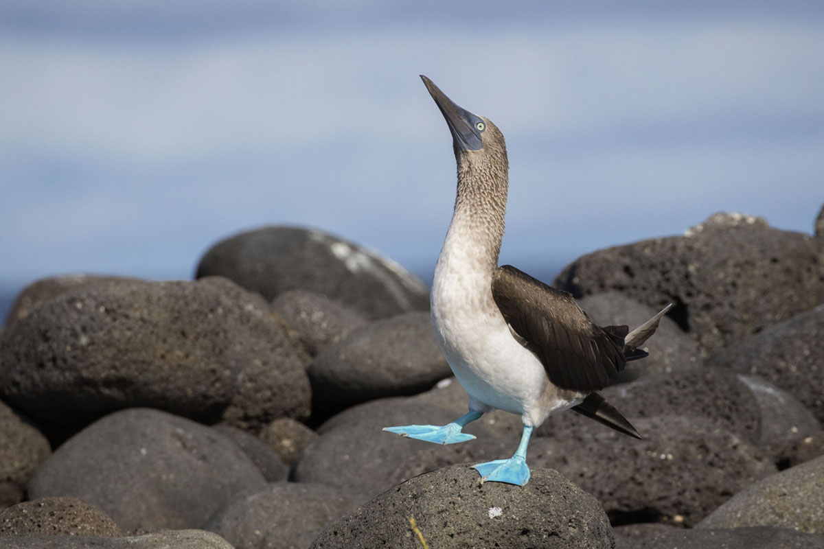
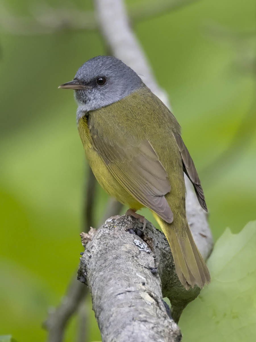
Caption Options
Options are available for caption display in the block sidebar under the Caption Styles panel. They include caption alignment, overlay caption and adding a border under the caption. The wide-aligned image above demonstrates the overlay option.
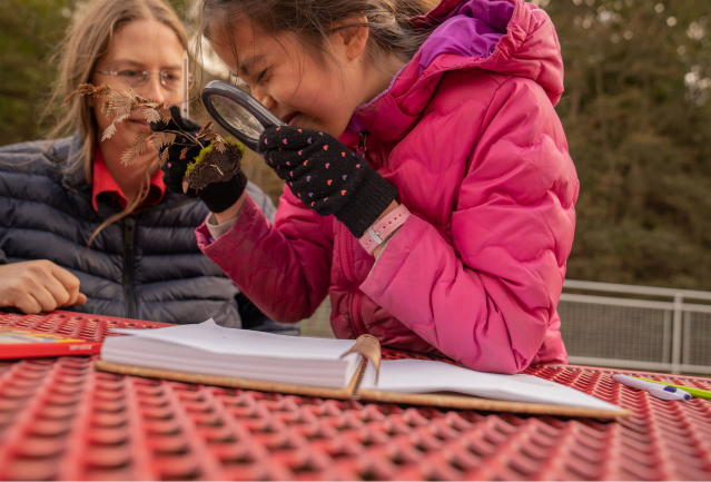
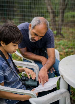
Gallery Block
Display multiple images in a gallery or slideshow with different display options.
The gallery is flexible. You can use a one- to four-column layout. Here is a three-column layout with four images.
NEW: If your images are not the same aspect ratio, you can set this in the block sidebar. Be Sure to select the Gallery block parent to see the option. We previously had this as a custom style.


Here is a two-column layout with the same four images.
Image grids
The following image grid layouts are available under the Styles panel in the block sidebar:
Grid 1

Grid 2
Grid 3


Grid 4
Captions can be added to the photos that are visible when the user hovers over the photo.
The images will crop to the proper ratio, centering on the longer side. Approximate image ratios are:
- Grid 1 & 2: 3:4 (tall image), 10:7 (half-size image), 7:10 (two smaller images)
- Grid 3 & 4: 1:1 (larger image), 2:1 (two smaller images)
Masonry Grids
A simple masonry grid style is available under the block transforms:


Slideshow
A variation of the gallery block that displays the images in a carousel.
Slideshows can be aligned center, wide, and floated to the left or right.
In the Gallery Styles panel, a width for the slideshow can be chosen – either 80% or 60% of the container width. The slideshow below is at 80% width.
By default, only one image is featured at a time in a slideshow. You can choose to show multiple images under the block sidebar’s Gallery panel. To do this, select Multiple (columns) in the Slideshow Style dropdown. Then select the number of columns.

Slideshow Accessibility
Due to Accessibility concerns, slideshows do not auto play and are controlled only by the user.
Slideshows can be made accessible to screen readers by adding an aria-label to tell what the slideshow contains. This is required when more than one are on the page so screen readers can differentiate between them. The default aria-label for each block is “slideshow” – to change this:
- Select the Gallery block
- Open the Accessibility panel on the block sidebar
- Enter an accessible name for the slideshow
Logo Gallery
A variation of the gallery block used to showcase partners with the logo option enabled. This option creates more space between gallery items, gives them a maximum width and vertically aligns the images to the center.
Cover Block
Add an image or video with a text overlay. Using the block toolbar, you can adjust the content placement or make the image full height of the screen.
The background color of the overlay can be changed in the styles tab (half circle) under Color > Overlay. The header color and overlay opacity is disabled for accessibility reasons.
Captions can be added to the cover block under the custom “Captions” panel. Alt text cannot be added to the cover block. The caption on this block has the following options: Overlay toggled on and text aligned to the right. It also has a gray background on the content area.

Heading 2
Cover blocks should only include a header and paragraph text. If you do not need text over the image, use a regular image block at full width (example above)
The Cover block also has the option for a background that stays fixed as the user scrolls. This can be toggled in the block sidebar.
Video Block
Embed a video from your media library or upload a new one.
All videos should be accompanied by a transcript (especially with voice over or text) or descriptive caption (no voice over or text). An example of a transcript is below the video.
Media Accessibility
Lorem ipsum dolor sit amet, consectetur adipiscing elit. Nulla fermentum ipsum ipsum, ut fringilla augue facilisis nec. Aliquam vestibulum dapibus lorem, vel maximus ipsum bibendum nec.
Aliquam porttitor metus id dolor dictum, non commodo magna consectetur. Cras orci nulla, dapibus ac ultrices eu, gravida in tellus. Praesent risus lorem, interdum et nulla volutpat, vulputate mollis nunc. Nam id orci enim. Fusce ipsum justo, semper nec velit a, vulputate semper justo.
Integer rhoncus mollis efficitur. Nunc sed elit consectetur, porta dui at, fringilla tellus. Vestibulum pulvinar, ligula ut ultricies rutrum, sem purus luctus erat, dapibus iaculis turpis est id dui. Aliquam non molestie arcu. Quisque vitae egestas mauris.
End of Transcript
Audio Block
Embed a basic audio player.
They can be aligned to float next to content or in the center between content.
File Block
Add a link to a downloadable file.
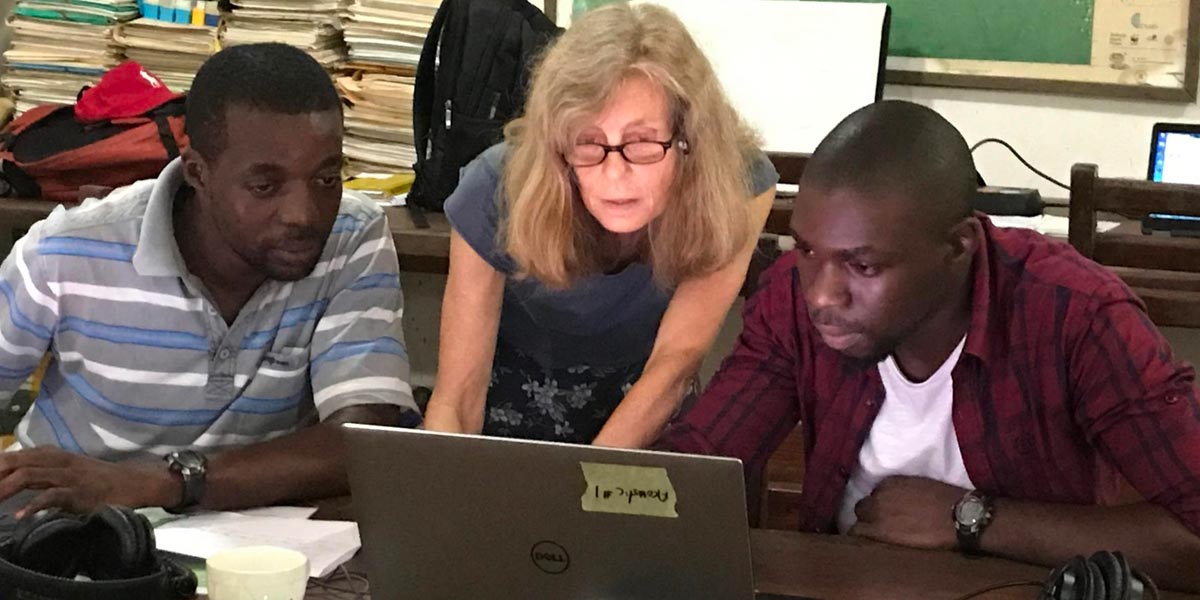
Media & Text Block
Set media and words side-by-side for a richer layout.
You can also use the Columns Block with an image in one column and content in the other.

The media and text block is an easy way to add an image or uploaded video in a column with text. There is the option to show the media on the left or right of the text in the toolbar.
This block can be aligned wide, which will fit the content area, or aligned full, which will extend beyond the content area.
This sample is aligned wide
The rest of this content is filler text.
Etiam magna ante, placerat sit amet finibus sit amet, posuere eu dui. Donec neque erat, pulvinar a ligula sit amet, iaculis pharetra tellus. Ut ornare sem eget enim pretium hendrerit. Suspendisse magna nulla, pretium ut sem ac, dapibus mollis leo.
Etiam risus risus, suscipit at vestibulum eu, dapibus ultrices orci. Donec finibus odio nibh, a ullamcorper ante tristique sed. In sed tincidunt ex.
Maecenas vel est et ex pretium tempor in in nibh. Vivamus aliquam eleifend dolor, vitae rhoncus nulla cursus ut. Vestibulum eget elementum ante, vitae euismod mi.
Left Thumbnail & Text
This is a variation of the Media & Text block for thumbnail images or logos. It is part of the block inserter, but can also be added through the Transforms to variation dropdown in the Media & Text block options.
Photographer Credits
If the images do not have captions with photographer credits, you can add a Photo Credit block pattern at the end of the page.
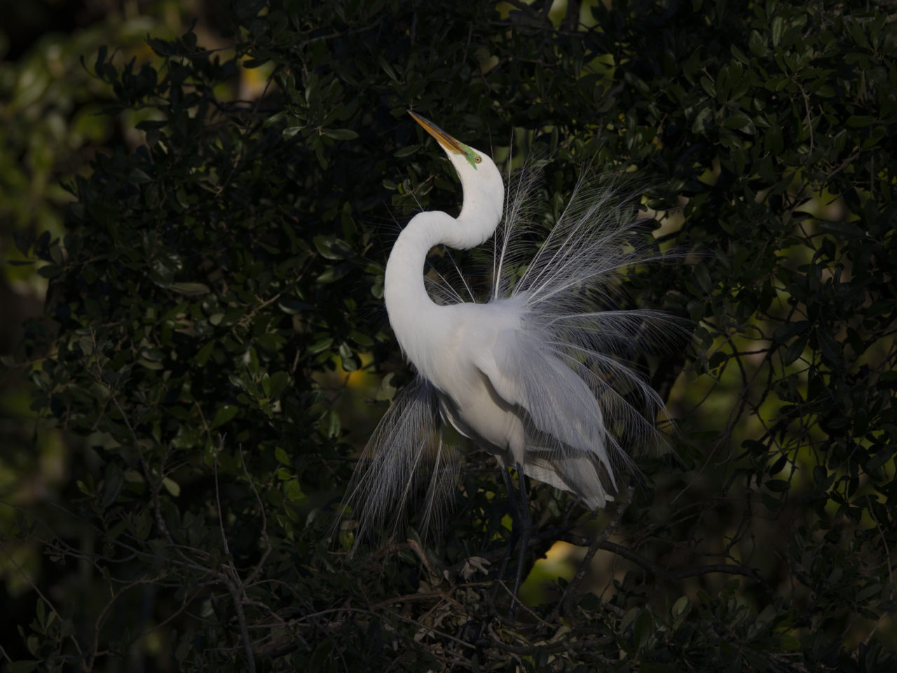
Photo credits: Snowy Egret by Photographer/Macaulay Library. Great Egret by by Photographer/Macaulay Library.