Design Blocks & Widgets
Available blocks: Accordion | Buttons | Columns | Group | Separator | Spacer | Shortcode | Social Icons | RSS | HTML
This page showcases the blocks under the Design and Widgets Categories.
Accordion
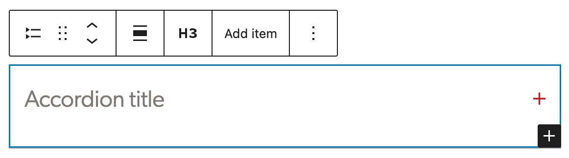
The Accordion block lets you show content in collapsible sections so visitors can expand just the parts they need. The block is made of nested layers which include accordion items; and within those are a heading and a panel. The heading is an h3 by default. Be sure to change if it does not fall into the correct header order. You can do this in the block toolbar from the parent accordion block. This will change it in all accordion items within the block. The panel is the content area of the block. To add a new block within the Accordion, select the parent block and click Add item.
Content goes in the content area.
Buttons
Prompt visitors to take action with a button-style link. Basic button styles are available under the Color panel. The background color can be changed to warm black, white, red, forest green, ocean blue, gold or chartreuse.
Note: External links must include http/s or they will not link properly.
Columns
Display content in multiple columns, with blocks added to each column. Column blocks offer a variety of options, however, we recommend using only two or three columns with widths of 50/50, 30/70 or 70/30 for two-column or 33/33/33 for three-column. These options are presented when you first add the block. Further column examples are displayed on this page showing usage with more than just text.
Some classes were added to hook into columns for special layouts. They can be added using the Modify Column Gap dropdown under the Margins & Padding Panel.
Two Columns
This is an example of using two columns with text.
The rest of the content is filler text. Lorem ipsum dolor sit amet, consectetur adipiscing elit. Suspendisse suscipit tincidunt justo, malesuada laoreet dolor tempus at.
Maecenas et arcu vel turpis bibendum semper. Pellentesque id pulvinar enim, vitae congue augue. Nam porttitor dui et posuere posuere. Etiam venenatis justo eu tortor rutrum maximus. Fusce ac urna sed sem accumsan commodo.
Borders can be added to individual columns to separate them a little more or add style. This option is under the Borders & Connecting Lines panel.
This content is filler text. Lorem ipsum dolor sit amet, consectetur adipiscing elit. Suspendisse suscipit tincidunt justo, malesuada laoreet dolor tempus at.
Maecenas et arcu vel turpis bibendum semper. Pellentesque id pulvinar enim, vitae congue augue. Nam porttitor dui et posuere posuere.
Three columns
Three columns should only be used for shorter content blocks.
First item
Short supporting text for this column
Second item
Short supporting text for this column
Third item
Short supporting text for this column
Group
Gather blocks in a layout container. This can be used to group pieces of content together. It is especially useful when content editors are moving groups of content around the page.
The group block is also used to create Call to Action, Gray Well and Sidebar styles. These can be selected under the Transform to variation dropdown in the Block sidebar.
Group Variations
Groups include several block variation. They can be selected using the block inserter or can be selected through the Transforms to variation dropdown in the Group block options.
Call to Action
Meaningful header
Supporting text for call to action. Default text alignment is centered and can be overridden using the block toolbar alignment settings.
Gray Well
Section Header
This can be used when there is more content than a CTA calls for. It will not span the page, but there is the option to give it a wider width.
Sidebars
Several design options sidebars are available with left and right alignment. They include a gray background, a border and with no background or border.
Announcements
Supporting text. Keep the content as short as you can.
Background Colors
Another way to draw attention to content or split content up on a page is by using background colors on the group block. Darker background colors will force white text and button colors. If you notice text that does not convert to the correct color on a background color, please contact the web team.
| Color name |
|---|
| White (default) |
| Warm Black |
| Gray |
| Color name |
|---|
| Ocean Blue |
| Ocean Blue Tint |
| Forest Green |
| Forest Green Tint |
| Color name |
|---|
| Sand |
| Sand Shade |
| Sand Neutral |
| Sand Neutral Shade |
| Sand Neutral Shade |
| Sand Neutral Tint |
| Color name |
|---|
| Sky Blue |
| Sky Blue Tint |
| Sky Blue Neutral |
| Sky Blue Neutral Shade |
| Sky Blue Neutral Shade |
| Sky Blue Neutral Tint |
| Color name |
|---|
| Gold |
| Gold Tint |
| Gold Tint |
| Chartreuse |
| Chartreuse Tint |
| Chartreuse Tint |
Group Block with light background color and no alignment
Group Block with dark background color and full alignment
To remove a background color, click on the three dots next to Color and select “reset” next to Background.
Separator
Create a break between ideas or sections with a horizontal separator. It is used throughout the blocks pages to separate the each type of block.
Spacer
Add white space between blocks and customize its height. These can be used to create space between content rather than using breaks or empty paragraphs. The spacer block has an option to add the animated connecting line between content under the Borders & Connecting Lines panel.
The connecting line can also be added through the variation dropdown or from the block inserter.
Shortcode
Insert additional custom elements with a WordPress shortcode. Some shortcodes are available with plugins such as Zotpress and MailChimp.
Social Icons
Add icons that link to social media profiles and pages.
RSS
Display content from any site’s RSS feed. This is a custom version of the core RSS block. Options include displaying up to 100 articles with date, source, author and/or excerpt.
- Changing climate brings pros and cons to P.E.I.'s birds and those who watch them , PNI Atlantic News
- Caws for celebration: Auburn holds first Crow Cawcus Convention , The Citizen
- The safest place to hang bird feeders in your garden , Country Living
Custom HTML
Add custom HTML code and preview it as you edit. This block is mostly used by the Tech Team to help customize CSS styles within a page.
Note: Adding Javascript to this block will prevent the page from being saved.