Block Styles
Styles and helper classes are available on certain blocks for minor tweaks. Classes are selected with drop down selects or toggles. They are organized in different panels depending on functionality.
Panel: Block Styles & Settings
Aspect Ratio
The embed blocks do not always pick up the correct aspect ratio for a video. The aspect ratio can be overwritten with this dropdown.
| Selection | Class | Block(s) | Description |
|---|---|---|---|
| 16:9 ratio | aspect-16-9 | Embed, Video | Forces 16:9 ratio on Embed if responsive is not working properly |
| 4:3 ratio | aspect-4-3 | Embed, Video | Forces 4:3 ratio on Embed if responsive is not working properly |
| Square (1:1) | aspect-1-1 | Embed, Video | Forces 1:1 ratio for videos originally shared on Instagram |
| Spectrogram (5:2) | spectrogram | Embed, Video | Forces narrow ratio on Embed for spectrogram videos |
Other Block Styles
| Option | Class | Block(s) | Description |
|---|---|---|---|
| Featured Media | featured | Images, Videos, Embeds, Gallery | Toggle larger width on left-aligned media |
| Toggle Quotation Marks | show-quotes | Pullquote | Show or hide quotation marks |
| Content Columns | two-col three-col four-col | Group | Create automatic columns (2-4) for a long list of text |
| Background Image URL | has-background-image | Group | Add background image to group block *special use only |
Panel: Borders & Connecting Lines
| Option | Class | Block(s) | Description |
|---|---|---|---|
| Top Border | top-border | Columns, Group | Adds border to the top of a block |
| Bottom Border | bottom-border | Columns, Group | Adds border to the bottom of a block |
| Left Border | left-border | Column, Group | Adds border to the left of a block |
| Right Border | right-border | Column, Group | Adds border to the right of a block |
| Add Border | border | Images, Videos, Embeds, Gallery, Pullquote | Adds border around a block |
| Toggle Connecting Line | connecting-line | Spacer, Columns | Connecting line option |
Panel: Captions
| Option | Class | Block(s) | Description |
|---|---|---|---|
| Caption Alignment | caption-left caption-right caption-center | Images, Videos, Embeds | Align media captions left, right or center |
| Overlay Caption on Image | caption-overlay | Images | Overlay caption over image |
| Caption Border | caption-border caption-no-border | Images, Videos, Embeds | Toggle border under caption |
| Caption | n/a | Cover | Add a caption to the cover block (not available by default) |
Panel: Gallery
| Option | Class | Block(s) | Description |
|---|---|---|---|
| Toggle Slideshow Class | gallery-slideshow | Gallery | Toggle image slideshow |
| Slideshow Style | multiple-columns | Slideshow | Show a slideshow with multiple images at once |
| Slideshow Width | width-narrow width-narrower | Slideshow | Maximum width of slideshow 80% or 60% of container width |
| Show Nav on bottom | slideshow-bottom-nav | Slideshow | Show arrow navigation under the slideshow rather than on the sides |
| Toggle Masonry Grid Class | masonry-grid | Gallery | Masonry-style gallery |
| Aspect Ratio | ratio-4-3 ratio-3-4 ratio-16-9 ratio-1-1 | Gallery | Forces aspect ratio on entire gallery at 4:3, 3:4, 16:9 or 1:1 |
| Logo List | logos | Gallery | Centers captions and limits media size, useful for partnership & sponsorship lists |
Panel: Margins & Padding
Add or remove spacing outside (margins) or inside (padding) of blocks. Classes can be added to the group and column block as well as individual columns.
Margin Options
| Selection | Class | Block(s) | Description |
|---|---|---|---|
| Add Top Margin | add-margin-top | Group, Columns, Column | Adds margin before block (2rem/32px) |
| More Top Margin | more-top-margin | Group, Columns, Column | Adds more margin before block (4rem/64px) |
| Remove Top Margin | remove-margin-top | Group, Columns, Column | Removes margin before block |
| Negative Top Margin | negative-margin-top | Group, CTA | Adds negative margin to the top of the block to remove the gap between a CTA and hero – ONLY use on first block |
| Add Bottom Margin | add-margin-bottom | Group, Columns, Column | Adds margin after block (2rem/32px) |
| More Bottom Margin | more-margin-bottom | Group, Columns, Column | Adds more margin after block (4rem/64px) |
| Remove Bottom Margin | remove-margin-bottom | Group, Columns, Column | Removes margin after block |
| Negative Bottom Margin | negative-margin-bottom | Group, CTA | Adds negative margin to the bottom of the block to remove the gap between a CTA and footer – ONLY use on last block |
| Modify Column Gap | more-gap less-gap | Columns | Add or remove gap space between columns |
Padding Options
| Selection | Class | Block(s) | Description |
|---|---|---|---|
| Add Top Padding | add-padding-top | Group, Columns, Column | Adds padding before block |
| Remove Top Padding | remove-padding-top | Group, Columns, Column | Removes padding before block |
| Add Bottom Padding | add-padding-bottom | Group, Columns, Column | Adds padding after block |
| Remove Bottom Padding | remove-padding-bottom | Group, Columns, Column | Removes padding after block |
Panel: Mobile Options
| Option | Class | Block(s) | Description |
|---|---|---|---|
| Mobile Order Priority | order-top order-second order-third order-bottom | All | Change the stacking order of blocks |
| Mobile Display | hide-for-medium show-for-medium | All | Hide on mobile devices Show only on mobile devices |
Panel: Accessibility
| Option | Class | Block(s) | Description |
|---|---|---|---|
| Accessible Labels | n/a | Slideshow | Adds an aria-label for screen readers |
Panel: Other Helpers
Container, Sidebar or Paragraph Width
Use wider or narrower container widths for the content on groups with full alignment. There is also a selection available for the sidebar that only contains wide and narrow options to select a wider or more narrow sidebar.
| Selection | Class | Block(s) | Description |
|---|---|---|---|
| Wide | wide | Group | Wide content container width |
| Narrow | narrow | Group, Paragraph | Narrow content container width |
| Narrower | narrower | Group, Paragraph | Narrower content container width |
Clear Float
Add a clear class to blocks that fall below floated blocks so that the floated element does not interfere with the block below.
| Selection | Class | Block(s) | Description |
|---|---|---|---|
| Both | clearboth | Any | Content will “clear” the float of an element that is floated left or right |
| Right | clearright | Any | Content will “clear” the float of an element that is floated right |
| Left | clearleft | Any | Content will “clear” the float of an element that is floated left |
Other
| Option | Class | Block(s) | Description |
|---|---|---|---|
| Float Margin | float-marginleft/right float-wide-marginleft/right float-narrow-marginleft/right | Columns, Text, Lists Media, Buttons | Fixes margin of block next to another floated blocks, if needed |
| Hide | hidden | Group | Temporarily hide content within a group block |
Panel: Colors
Note: these are found in the Styles Tab (half black & white circle)
Header and Paragraph Text
There are limited text colors available: Warm Black, Gray and White. Warm Black is the default text color. White is default on darker background colors.
Group Background
Background colors are available on the group block to separate or accent areas of content. Darker background colors will force white text and button colors.
| Color name |
|---|
| White (default) |
| Warm Black |
| Gray |
| Color name |
|---|
| Ocean Blue |
| Ocean Blue Tint |
| Forest Green |
| Forest Green Tint |
| Color name |
|---|
| Sand |
| Sand Shade |
| Sand Neutral |
| Sand Neutral Shade |
| Sand Neutral Shade |
| Sand Neutral Tint |
| Color name |
|---|
| Sky Blue |
| Sky Blue Tint |
| Sky Blue Neutral |
| Sky Blue Neutral Shade |
| Sky Blue Neutral Shade |
| Sky Blue Neutral Tint |
| Color name |
|---|
| Gold |
| Gold Tint |
| Gold Tint |
| Chartreuse |
| Chartreuse Tint |
| Chartreuse Tint |
Button Colors
For dark backgrounds. When a group has a dark background, this should be a button with a white border and text by default.
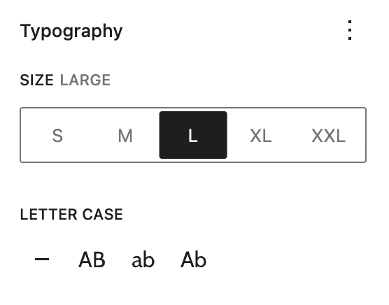
Panel: Typography
Note: these are found in the Styles Tab (half black & white circle)
Text Size
Different text sizes may be needed in certain cases. Only use Larger header sizes on a small amount of text.
H2 Small
h2 Medium
H2 Default
H2 Large
H2 XLarge
H2 XXLarge
H3 Small
h3 Medium
H3 Default
H3 Large
H3 XLarge
H3 XXLarge
H4 Small
H4 Medium
H4 Default
H4 Large
H4 XLarge
H4 XXLarge
Paragraph Small
Paragraph Medium
Paragraph Default
Paragraph Large
Paragraph Extra Large